Chiaroscuro Review
Last month’s assignment was ‘Chiaroscuro’. Chiaroscuro is an Italian word and it translates as Light-Dark. In art, chiaroscuro is defined by the use of strong contrasts between light and dark. In photography, you may have heard it being referred to as the low-key or Rembrandt lighting effect.
In this assignment, you were to take pictures that have a strong contrast between lights and darks. By doing so you’ll develop your skills in the control of light and your vision in looking for subjects/scenes that show a strong contrast between lights and darks.
We had loads of amazing entries, so it was hard to choose our favourites. But here at The School of Photography, we have picked a few that we liked the best. To join in with these assignments please sign up to our TSOP Membership here.
©Benjamin Alllen

©Dave Amber

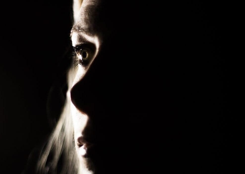
©Deborah Page

©Mandy Short

©Mark Fullbrook

©Michel Roels

©Pauline Gibbs

©Simon Eastmead

©Steve Narey

©Steven Law

©Stig Larssëther

©Yisell Austin
Thank you to everyone who entered into this month’s theme, even if you’ve not been mentioned here, you’ve gone out and practised and from that you’ve learnt and taken another step forward in your photography journey. And remember these are ‘our’ favourites and in this subjective world of photography, your favourites are just as valid as ours.
This month’s assignments is ‘Space’. To join in on our assignments become a TSOP Member here.
Thanks for watching and remember – Learn more at The School of Photography.